I’m excited to follow up with all of you on my previous post about real estate lead generation, because today I’m taking a deeper look into some real estate lead generation websites I’ve worked on over the past year.

Some of the work I have to show you is from as far back as January of 2017. However, I still continue to produce marketing projects for this client to this day. I’m going to share with you some traffic campaigns, email sequences and SEO work I’ve created in the real estate marketing niche.

Basically what I am sharing with you is a case study of 18 months worth of work on building different real estate lead generation websites. To make this post easier to navigate I’ve included a table of contents with auto-scrolling links to the various sections. Enjoy!

Over the last year and a half I have been managing the marketing for serial entrepreneur, Erwin Szeto (the client), who is listed on the top 20 influencers in the world of real estate in Canada. He’s on the list with the likes of Stefan Aarnio, Scott McGillivray and the Property Brothers, Drew and Jonathan Scott. I like to think my marketing work has played some small part in propelling him to that status.

I met the client through my association with the Rock Star Inner Circle, which is a network with hundreds of small business entrepreneurs.

When I first met the client he was largely known as “Mr. Hamilton”. The client explained to me that he had positioned himself as a trusted expert on real estate investments within the Hamilton area. However, he wanted to expand his business to include more regions on the west side of the GTA, like St. Catharines and Niagara. The client had recently switched from using TopProducer to Infusionsoft for his CRM.

Also, the client was hosting his own monthly networking events for lead generation and so he was interested in running a PPC advertising campaign for the very first time to increase the attendance.

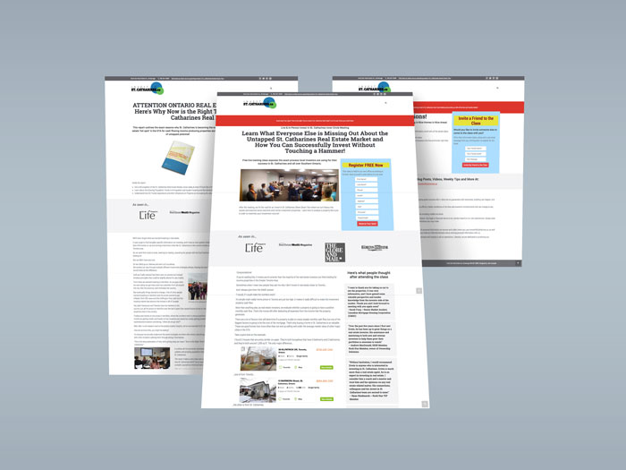
Niche Content Microsite

The first thing I got started on was a whole bunch of keyword research and SEO. I proposed creating a niche content microsite that included SEO articles targeting geographic keywords & topics with above-average click volume and low competition. The articles would be repurposed into a downloadable PDF, which would be used as a lead magnet. With the microsite being built with WordPress I would use a plugin for pop-up opt-ins. I knew all of this would make for a valuable real estate lead generation website and the client accepted my proposal.

investinstcatharines.ca

And thus, investinstcatharines.ca was conceived.

Google Ads Campaign

Again, this was the first time the client was trying paid traffic with Google. In order to meet the high expectations of pay-per-click advertising I called on my friends Thomas and David from Reverb Consulting.

I wrote and designed landing pages on the investinstcatharines.ca domain. A 3-step traffic funnel was created to generate leads for the networking event. The first page offered the lead magnet, the thank you page followed up with the networking event offer and then the final page allowed users to refer a friend to join them at the event.

real estate lead generation

Infusionsoft Marketing Automation Campaign Builder

I incorporated marketing automation with Infusionsoft by creating various email sequences to track who received the lead magnet, who registered for the networking event, who attended and who was a no-show. Based on the tagging I could segment the leads into different groups for future marketing offerings.

email automation

THE RESULTS

Below are some highlights from the Google Ads campaign. I’m really proud of the results because our efforts lead the networking event to grow so large that another venue was required to accommodate everyone.

In just 6 months time, I grew the attendance by 292.5% from 27 people to 79 people.

You can see in these before and after pictures why we had to move the networking event to a larger space. The attendees were essentially getting squeezed like sardines inside the office meeting space in Oakville. So the networking event moved to the Sheridan College Conference Centre.

Here’s an overview of the results from the Google Ads campaign.

TOTAL SITE SESSIONS

Paid Search accounted for 26% While still accounting for over 50% of all conversions.

In the first 3 months of site launch, paid search accounted for 40% of site sessions and 82% of goal completions. Organic traffic never accounted more than 40% of total traffic.

Total Site Sessions: 4605 Unique Visitors

PAGES PER SESSION

Often with ads, (when done poorly) you will see a low number of pages per session. When people are unfamiliar with a brand and they ended up on there because of a click they are likely to bounce. This shows that our ads were targeted with appropriate copy to bring in the right people.

Pages Per Session on ads was 2.55

PAID ADS CONVERSION

Generally, the lowest conversion rate on a site will be seen by ads. It stands to reason that the people who have actually searched out your site directly would be the most likely to convert compared with those who’ve ended up there because of an ad they just saw. However, the average conversion rate for organic traffic was 1.49% with the next closest to paid ads being referrals with 6.18%. We were able to outperform both organic and referral traffic as the highest converting channel.

Paid Ads Conversion rate was 9%

OVER 242 GOAL COMPLETIONS

This is where we can look at everything that happened over the course of the campaign. As you will see paid goal conversions accounted for over 50% of the total amount. What you don’t see here is that both direct and organic have first click attribution numbers from paid. Meaning, while they eventually converted through a direct visit or an organic search, there is initial contact made with adwords:

Paid: 133
Direct: 61
Organic: 24
Referral: 24

ADWORDS SPECIFIC HIGHLIGHTS

Totals for the campaign

Total Clicks: 1739
Total Cost: $4,308.11
CPC: $2.48
Bounce Rate From Ads: 25%
Average Pages per Session: 2.56
Goal Conversion Rate: 8.69% (Average for site was 3.74%)

I’m proud to report that the client spent $4,308.11 for the advertising campaign, which grossed $14,939 in sales from leads generated during the campaign.

Split Testing Headlines

While collaborating with Reverb Consulting, we had noticed we were experiencing a drop off between people who converted on the first landing page but then did not convert on the second. This drop off was bigger than what we wanted to see. It was an indication to us that something about the second page was not connecting with visitors.

So, in the forth month of the PPC campaign we decided to set up a split test to try different headline copy ideas.

The second landing page was the one with the offer to get on the guest list for the networking event. During this time, the client’s networking event was called the St. Catharines Inner Circle Meeting.

The headline on the landing page mentioned St. Catharines by name, so we had a hunch that maybe our ad traffic was getting confused and thought the networking event was actually taking place in St. Catharines, when it actually took place in Oakville.

A lot of our click volume was coming from the Halton region, including areas like Oakville, Milton, Burlington etc. We hypothesized that our traffic wasn’t taking up the networking event offer because they believed the event was in St. Catharines and therefor to far of a commute to attend.

I decided the best way to alleviate this problem was to remove the mention of St. Catharines in the headline to see if it would improve the conversion rate.

And sure enough it worked!

Insights And Discoveries

I also want to note that the data we collected and the split testing we were doing lead us to another insight. When we first started the campaign we cast a pretty large net for geo-targeting. We were showing our Google Ads to anyone who was searching our targeted keywords across all the major cities in the GTA.

Over time we began to notice that most of the clicks on our ads were coming from wealthier cities in the GTA. Meaning that people in Hamilton, Kitchener, Waterloo, Cambridge, Guelph etc. weren’t looking for real estate investment opportunities in St. Catharines as much as people from Oakville, Mississauga and Burlington.

This lead us to switching up some of our marketing tactics going into the back half of 2017.

Halton REI Microsite

Armed with these new insights, we decided to do a quick rebrand of the networking event. The client decided to call it the Halton Real Estate Investors Meeting, or Halton REI for short.

I quickly got to work on making a new WordPress site for the Halton REI, which was great because with the expert search engine optimization work I had done for this new site, we could organically target people searching for investment property info on the westside of the GTA but who lived near Halton. We use this site to collect leads for the networking event.

real estate lead generation websites

Throughout the rest of the year we made marketing videos to promote the networking event including testimonials and reactions from the attendees. The client also has a podcast website and another website about real estate investment information in Hamilton that I managed. We even got into some retargeted Google display ads before the end of the year.

The Secret Organic Traffic Strategy You Need for Your Real Estate Lead Generation Websites

If you’re creating your own real estate lead generation websites and you’re hesitant to spend money on paid traffic advertising with Google or Facebook, this is what I would keep in mind…

Over the last year and a bit I’ve been looking back and reflecting on all the real estate lead generation websites I had done. I had figured out how to best build a website and how to target keyword content to generate qualified traffic made up of investors doing research on which cities would be good places to invest in real estate.

I had figured out how to create appropriate lead magnet content to collect subscribers and grow the client’s audience. And then I figured out how to market the networking meeting to grow the attendance each month.

If you’re a realtor looking for real estate investor clients and you’re trying to figure out your own digital marketing or website strategy I have some advice I would recommend.

First you need to pick a particular geographic area you want to position yourself as an expert. Let’s say you’re a realtor in Durham Region (east side of the GTA). You would need a website ranking for content that investors would be searching about in Durham.

Then you need to market your realtor services for those geo-locations. Create web pages about why your services are better than the competition in the cities and neighbourhoods you want to target.

When building out a website you need to be conscientious about its architecture. It’s good practise to group your content into silos; where you’re creating a ‘parent page’ that links out to ‘child pages’ within it.

For example, you could make silos like this:

  • durham real estate investing
    • durham population
    • durham economic development
    • durham real estate market
    • durham zoning bylaw
    • durham transit
  • durham real estate investor services
    • pickering real estate investor services
    • ajax real estate investor services
    • whitby real estate investor services
    • oshawa real estate investor services
    • clarington real estate investor services
    • scugog real estate investor services
    • uxbridge real estate investor services
    • brock real estate investor services

If you build out a content marketing strategy like this for your website you should notice that you probably won’t get a TON of traffic, but it will be HIGHLY QUALIFIED and most importantly it will be ORGANIC.

This means you won’t have to spend thousands and thousands in ad spend to generate real estate investor client leads like my client did. Your website should be able to do that for you all on it’s own. Just remember to always take your time and create high quality content that will build trust in your audience and position yourself as an authority.

If you found any of the information in this article useful, leave me a comment below. Feel free to follow up with me with any questions you may have.

And if you’re looking to generate real estate investor leads with your own website and would like some help or advice, then definitely reach out to me on my contact page.


I mentioned in a previous post that bold and colourful gradient background have become one of the more versatile web design trends of late.

gradient background

The ubiquity of gradient backgrounds in social media.

Gradient backgrounds are popping up more frequently in social media when users post status updates. And with screen resolutions improving all the time gradients look more smooth and subtle than ever before.

So I thought I could put something cool together that hopefully may inspire others in their work.

I’ve made a collection of my favourite colour gradients and organized them into a gallery for your viewing. Each image in the gallery has the hex codes that were used to create the gradient.

Gradient Background Gallery

Have you wondered why colour gradients are becoming so trendy right now? I think in a lot of ways it’s a progression from the flat design practise that’s been popular over the last 5ish years.

Take a journey with me through time, won’t you?

Back in the turn of the decade (that’s 2010 for those of you keeping up) the use of smart phones and touch interfaces was gaining steam. For the first time people were browsing web pages on their phones and designers needed to create visual clues that certain elements on a page were interactive. This was achieved predominantly by three concepts of design thinking: three-dimensional effects, skeuomorphism and realism.

And while some of these concepts worked well for desktop browsing they weren’t entirely great for mobile. Back then user-interface design elements consisted of a lot of glossy material-looking rounded corner buttons.

skeuomorphism

A sample of skeuomorphism UI design from around 2010-2011.

In an attempt to simplify the aesthetics and create interfaces that were authentically digital, designers started down the path of minimalist design by throwing out the need for glossy or three-dimensional shadowing effects.

But designers were in uncharted waters back in those days. Issues began to arise when users were becoming confused with what was interactive or not. In order to sort out errors in user efficiency, flat design evolved into what some now call “flat 2.0”

flat design

The use of flatter elements brought on a more intelligent use of colours.

While the flat aesthetic that took us from 2012-2017 is sleek and easy to look at, I found its major flaw was that it completely abandoned the concept of realism in design thinking. In reality, the human eye perceives depth through colours and shadows. Just think about nature. Look at the Toronto sky to the east in the mornings. You’ll most likely see graduated colour – blues, reds, oranges, yellows.

This is the same concept that’s being introduced to the design industry right now. Gradients and shadows help add a level of depth and reality to the design when done well.

mobile ui design

This is what the future has in store for gradient backgrounds.

Be sure to check out UIGradients for more gradient colour combinations.

Remember what web design trends use to look like in the 90s and 2000’s?!?

Things were simple back then; more attention to text and the pages remained quite dull.

Just take a look at fanfiction.net, which has been around since 1998. It’s a great example of a typical web page back from the ol’ Web 1.0 days.

web 1.0

FanFiction.net…you don’t look a day past 1998.

Things have come a long way since then.

With the increasing importance of web technology for businesses and individuals alike, and with the introduction of new uses such as mobile, designers needed to come up with new design concepts. We’ve been through material designs, hamburger menus, animated backgrounds, and in general simple typography and designs to cater for the increasingly speedy nature of modern life.

When you spend as much time online as I do, and when you’ve been surfing the net as long as I have, you start to notice some things.

I’ve put together a list of web design trends that I’ve noticed throughout the last year.

Hamburger menus

This trend came out of the mobile-first approach as a design solution for smaller screens, however they’ve risen in popularity and are being used on desktop screens. A hamburger menu rids the need of taking too much room on a website, and makes a site appear free of navigation clutter like drop-downs, social icons, search bars and utility links. Since most people are familiar with the usage of a hamburger menu their ubiquity across screen sizes may go unnoticed.

Vertical user flows

Mobile is here to stay and Google confirmed last year that it witnessed more searches via smartphones than desktops. This has caused many web designers to give their websites the feel of vertical patterns and scrolling. There was a time back when I was in school where people built horizontal scrolling sites, and they were cool!

But you just don’t see them around anymore.

Now it’s become important that websites allow users to scroll more on smaller screens. In short, vertical user interfaces have become the thing of present in 2017. The act of vertical scrolling is being used to lure prospective customers into moving down deeper into a site’s content, and thereby increasing conversion rates.

Fewer menu options

If you were paying attention in 2016, many websites were redesigned with reduced primary navigation options. This has only continued in 2017. Header menus that previously presented 5-7 options have been reduced to 3-4.

Back to top

Themes and colours

Modern retro

Whether it is pixel art, vintage typography or 80s and 90s inspired imagery; retro with a modern twist is in right now. It has been having a greater influence on web design over the last few years, with many sites making use of this style.

Dark aesthetics

youtube dark theme


I’ve noticed the last while that the current versions of my software tools have been released with dark UI designs. I think this trend is becoming more common in web design as YouTube has released an optional ‘dark theme’ this past year.

Bright gradients & two-tone photography

Gradients have been huge lately. A good example of this would be Agadir-based agency symodd.com who make this two-tone effect look fresh and modern, with their full-screen, gradient-washed homepage.

Toning has always been one of the most accessible photo manipulation tricks designers can use in Photoshop and Lightroom, and these parred-down, two-tone colour schemes look cool and contemporary on Australian Design Radio.

Landing pages with monochromatic colours and a contrasting CTA button

CTAs (call-to-action) should always stand out, and a bright pop of colour on an otherwise neutral or contrasting colour palette can really do the trick.

Back to top

Fonts

Dynamic & bold typography

The advent of Google Fonts and Adobe Typekit has made using new and different fonts and scaling them to large sizes much easier than it ever used to be. It’s allowing designers to be able to do simple and dramatic layouts, which is benefited by today’s high-resolution displays. Basically, it gives you the opportunity to display your brand identity in a unique and differentiated way.

More and more companies are turning to big, bold typography in the ‘above-the-fold’ to anchor their home pages. This style works best when the rest of the page is kept minimal and clean. Much like these examples here.

More serif typefaces

For anyone who’s studied design in school, you would have heard that sans serif typefaces are preferred on screen displays. They are believed to be easier to read than serif fonts. Serifs or other typefaces with thin alternating strokes can disintegrate at certain sizes or screen resolutions. However, since more people have high definition screens on all their devices, this has lead to enhanced readability and designers are now making greater use of serif typefaces.

Mixing horizontal and vertical text

Freeing text from its usual horizontal alignment and placing it vertically on a page adds some refreshing dimension. Take this example from director Matt Porterfield, which mixes horizontal and vertical text alignments on an otherwise very simple page.

Oversized type

Source: nurturedigital.com

In-your-face lettering is going to continue to get bigger and bolder. From single word homepages that ask users to move through the design on a whim, to words in interesting typefaces or with splashes of color, text is more important than ever.

Back to top

Graphical elements 

More Authentic Imagery

Every business owner who’s been making a living online since the early 2000’s has always told me, “never use stock photography.”

Who ever knew these people were 10-15yrs ahead of this trend?

Because of the popularity of Instagram and other visually driven platforms like Pinterest, there has been a significant increase in companies and websites opting for authentic photos rather than generic stock images.

Business owners realized the importance of showing real people and company processes, to establish a stronger connection with their clients and to “put a face” to the brand. Photographs, custom illustrations, as well as cartoon type of videos are a powerful tool for attracting new clients, easily explaining a new concept and building up strong brand recognition. 

More SVGs

Scalable vector graphics (SVGs) present plenty of advantages over traditional formats such as PNG, JPG, and GIF. Instead of being pixel or raster-based, SVGs are resolution-independent, so they will appear stunning on any device or screen. Are you using SVGs in your design work yet?

Hybrid material design

There was a trend in design for going very flat. Microsoft’s operating system is indicative of this. They got rid of shadows, textures and everything got super flat. That was predominantly the style for a while and now we’re starting to move away from that.

Google has developed something called material design which is essentially a hybrid between flat and a little bit of a more volumetric shape built into it, so it’s easier to navigate and move around while protecting the modern visual aesthetic. Also, material design is better for mobile in terms of understanding how to navigate and what you actually need to do on the website or app.

Full-width & full-screen media

Full width image/video sliders are very trendy these days. Studies have shown that large images make people stop and take notice. It’s exactly that kind of “interruption” that contributes to higher levels of conversion.

Illustration

More companies are turning to illustrators and graphic artists to create bespoke illustrations for their websites. After years of flat design and minimalism, adding illustrated touches to your site is a great way to inject a little personality, as seen in this charming example from NewActon.

Geometric shapes and patterns

Whimsical patterns and shapes are popping up more frequently on websites, adding some flair in a landscape otherwise ruled by flat and material design. Toronto-based design studio MSDS uses patterned letters on their homepage.

Back to top

Video, animation and sound

GIFs and Cinemagraphs

Whether they know it or not, people love animation. Everything from large animated backgrounds to subtle small animations like GIFs and button hovers. The human eye is immediately attracted to any movement. Animation creates a level of visual feedback for the user, which in turn, makes for more attractive and engaging experiences.

Cinemagraphs (high-quality videos or GIFs that run on a smooth, continuous loop) have become a popular way to add movement and visual interest to otherwise static pages. They are even being used more commonly in display advertising.

The ability to create animated loops is much more accessible now than in days past. Back in school, I had to approach animation projects from the concepts found in stop motion. Basically, I was drawing and/or photographing every single frame and then using computer software to make a video out of it. It was always a lot of work even to just make the shortest of animations.

These days it’s almost like you’re working in reverse. In the case of cinemagrphs, you can use mobile apps (like Flixel) to shoot video first and then use software to make animated stills. Another way to look at it is as a subtractive move. You’re taking information out of the video to make still motion. This has shortened the overall time it takes to make an animation. As a web design trend animation will only continue to change and evolve but we’ll always be using animations in our designs.

Videos with sound

One thing I’ve noticed this past year in social feeds like Facebook and Instagram is that when scrolling past videos they now autoplay with sound. Whereas before, they would autoplay with captions and the user needed to click on the video to get audio.

There was a time in the last 5 years where Google and Facebook would penalize advertisers who drove paid traffic to landing pages that had videos that would autoplay. I’ve personally found more lenience towards this recently. It also has me believing that users are becoming more accustomed to autoplay media while online.

Back to top

Broad Observations

Responsive First Approach to Design

‘Mobile’ and ‘responsive’ design are buzzwords that have been thrown around a lot in the last several years. With that being said they have also changed a bit as well and I’d like to provide my own distinction. Responsive design is an approach to web design that uses CSS media queries and flexible layouts.

The ‘mobile first’ approach simply means designing for the smallest screen first and then working up from there.

Not too long ago website owners use to have separate stylesheets for different screen sizes. Essentially having one set of pages for desktop and another set for mobile.

There has been an upgrade to web design thinking in how website owners manage their sites. The ‘responsive design’ approach really is an evolution over the ‘mobile first’ concept because it reduces the number of files needed for browsers to display a site. Removing this bloat makes websites run better so designers can truly focus on user experience.

Emphasis on the content

We’ve spent years adding things to our websites such as sidebars, headers, banner ads, sidebar ads, popups, social media buttons, etc. All of these elements have ended up cluttering our websites and taking up more and more real estate, taking the attention away from the entire point of a web page: the content. In 2017, websites started moving back to basics and placing more emphasis on content.

No more traditional web design

Companies are beginning to wane on using traditional web design concepts. In the old ways, the role of the design was to make the tech look good to the audience. With the emergence of experience design, the focus and reach of web design have shifted. By using human-centered concepts, it has frantically changed the way we view web designs. User experience has become the basis for web design now.

The start of the end of flat design

All the rage that once existed in flat web design has just about run out. Web designers have just about burned out from applying the same basics over and over again. Because this technique is being used by virtually everyone, websites often look the same overall.

We may be looking at a future where flat web design may become obsolete. In their place, more imaginative and unique layouts and designs will take over.

Back to top

New technologies

Virtual reality & 360 videos

Virtual reality has never had such a bigger year than that of 2016 and now it can be experienced on browsers as well. It has been gaining momentum very quickly and has been seen in Samsung commercials as well. VR is on the same path as that of conversational interfaces. However, the user interface challenges with VR are far more robust and easier to understand than conversational interfaces. I’m expecting to see a lot more virtual and augmented reality in the near future.

AI-powered bots and conversational interfaces

In terms of visuals, bots are unlikely to have a big impact on web design, but they will significantly influence how designers think about creating websites. AI-powered bots are going to get even more realistic and complex, empowering businesses to automate communication and sales. Using tools like Letsclap, online businesses will be able to connect with their customers via messaging apps like WhatsApp, Facebook Messenger or WeChat, providing customized customer support and commerce. Conversational interfaces will be a huge shift, helping big brands express different sides of their personality and making them more human and approachable.

More than 900 million people around the world use Facebook Messenger every month, so the introduction of Bots for Messenger last year was a welcome addition to the toolkit of communication channels for businesses of all sizes. Any brand can build a Facebook bot now without any coding knowledge. Integrations with tools like Botsify or Chatfuel make the setup process so simple that it’s becoming unusual not to use a customized bot. This year, we’ll see the conversational interfaces reach a higher level of personalization and inventiveness.

Back to top

Web design trends

Do you agree with the web design trends you have seen in this article? Have you seen some unexpected web design trends or changes from previous years? I’d love to hear what you have to say so leave a comment below.


Subscribe to my email list so we can keep in touch.


I’ve been working in my professional career for over 4 and a half years now. To most people that’s probably considered not very long. But I can still remember a time when I was a recent graduate just entering the work force. I was all doey-eyed and idealistic. And man, has the ‘real world’ of privatized corporations and public sector bureaucracy crushed my soul.

I always thought of myself as a creative and an artist. I mean, reading books and academic literature about theses topics; I fit the descriptions.

I had this expectation that if I pursued interests in art, creativity and design, I could provide some real cultural value to the world and feel fulfilled.

But the longer I’ve worked in my career, I’ve realized the ‘real world’ doesn’t hold the same values as I do. Much of the artistic and creative endeavours that I adore are often commoditized.

But let me back up and provide some much needed context for my thoughts…

My own personal story

In one of my first jobs, I was hired as a multimedia designer. It was my job to help make graphics, build websites and edit videos. With my background in multimedia and copywriting this seemed awesome.

But what I soon realized was that my bosses wanted me to administratively manage design related projects being outsourced to external freelancers and agencies, rather than produce them myself. These business owners felt it was more productive and cost efficient to outsource design work for as cheaply as possible, with services like 99Designs and UpWork, rather than have the work done in-house.

I remember one time, a graphical HTML email layout needed to be created. At that point, I had never designed and coded one before. It seemed like a new challenge and I wanted to do it for no other reason than I had a passion to learn and to create. But my boss wanted me to outsource the work to someone online in the Philippines for “$5 an hour and a bag of rice.” (He was being sarcastic about the bag of rice). My boss thought my time was better spent managing this outsourced freelancer, who was only going to make edits to a pre-made template that fit our needs, than giving me the opportunity to try new work and to grow.

I begged and pleaded for my boss to let me do it and eventually got my boss to break (he was actually a pretty stand up guy after all, and I understand he was only trying to run the most lean business possible), but that’s when I started to realize how much little value business owners give to design work. And experiences like this happened over and over again even when I moved onto other jobs.

And maybe you’ve experienced this too, where you have design skills but your client or boss is asking you to outsource the work to someone, or even groups of people, online for faster and cheaper than it would take if you had done the work yourself.

In an article of How Magazine, titled “An Irreversible Movement,” by David C. Baker, he said:

Design is or (soon will be) approaching commodity status, but the management of the design process is difficult, misunderstood, and undervalued.

As a young professional in the beginning of my career, I was watching this happen right before my eyes. The very work I loved doing was commercially becoming less and less valuable.

But I’m getting ahead of myself again and need to back up and answer the question…

What is a Commodity?

And to answer this I’ve pulled together a few definitions from online dictionaries.

  • Commodity: a physical substance, such as food, grains, and metals, which is interchangeable with another product of the same type.
  • Commodity: a good or service whose wide availability typically leads to smaller profit margins and diminishes the importance of factors (as brand name) other than price.
  • Commodity: a good for which there is demand, but which is supplied without qualitative differentiation across a market.

So there are some related ideas above. And I think I can adequately define a commodity as a good and/or service where there is little difference in quality across a market and where the buying decision comes down to price and price alone.

Keep this in mind as I go along. So the next question becomes…

What is Design?

This is another question that needs to be address, but defining design is a topic that on its own can take several posts. So I’ll keep it simple and straight forward.

To me, design is a planned solution to a problem.

When we’re talking about graphic design and visual communication, the problem is naturally one of communicating a message to an audience visually. When we talk about web design we add in solving problems of usability and other technical concerns.

Rarely if ever is there a single solution to a design problem.

I think part of a designer’s job is deciding the best, or most appropriate, solution to a problem. This then implies that there is more than one solution to any given problem. And if there can be multiple solutions to a problem, this then implies that some solutions are of higher quality than others. And if designers can judge the quality of a solution, then the quality of design varies across a market.

On the other hand, is there truly a best solution? I mean, you and I could come up with a different design for any client, but does that necessarily mean your design is better than mine or mine better than yours? In order to answer that I think we need to judge a solution based on its application of creativity.

So now we have to ask ourselves…

What is Creativity?

Here are some more definitions I came across to explain what creativity is and what role it plays in design:

  • Creativity is the ability to generate innovative ideas and manifest them from thought into reality. The process involves original thinking and then producing.
  • Creativity is the ability to produce something new through imaginative skill, whether a new solution to a problem, a new method or device, or a new artistic object or form.

We’re getting a collection of buzzwords here: innovative, original, new, imaginative, artistic. These are not words to describe a commodity. These words hint at qualitative differences, and in my definition of commodity above, I stated that commodities don’t show qualitative differences from solution to solution in a market.

I think creativity plays a crucial part in design.

I would argue that despite what we were told growing up in school, we don’t all possess significant creativity. Few people have true creativity and even fewer people are skilled at employing it.

I mean its true, anyone can make something, and anyone can make something up, and in this mundane sense everyone is creative.

But in a design-relevant definition of creativity, one must have the capacity to think differently, see differently, and make connections and perceive relationships in a way others would miss.

The point I want to make thus far is that I believe that design, or any of the other arts, is intrinsically separate from any notion of commoditization.

And yet, I’m personally experiencing an ever increasing transformation of design into a commodity in my career.

Now onto the hard-hitting questions…

Do Clients Value Design?

On some level they must, otherwise, why would our clients hire us, right? But if you search any small business forum it won’t take you long to find many people expressing opinions that design isn’t important, especially on the web. There’s a common thought that design isn’t necessary.

Personally, I think people are referring to design aesthetics when they say this, and to most people design and design aesthetics are one in the same. They’re not differentiating design and art. They point to examples like Craig’s List to show that you don’t need design to be successful. Personally I think there’s a lot more design in Craig’s List than people give it credit for. Aesthetics? No. Design? Yes.

Often I hear business owners claim content trumps design. And it’s true. Most people will put up with a very bad design if they feel the content is worth the effort.

However, from what I can tell most people don’t see the value in design. You and I do, but we’re designers. We think design matters and equate code to poetry. The best designs are often unnoticed to those not in the profession. It’s only when design gets in the way that people realize it’s impact. Bad designs stand out to the average user. Good design is seamless and unnoticed.

If the average person doesn’t see value in design, if they don’t see the difference between good and bad design, then what is the criteria for their buying decision? Likely price. If people don’t see the value of your services and can’t see the difference in what you offer as compared to the next designer aren’t they viewing you and design in general as a commodity? I would argue yes, and this is what I’ve been witnessing for years now.

It’s even possible that this has been happening for decades, it’s just that I haven’t been in my career long enough to be aware of it.

Designers have been commoditized

Let me ask you something.

If things like design patterns and design templates and website themes are the tools our clients ask us to use in our work, doesn’t that lead design down the path of commoditization? If we’re all using the same WordPress themes doesn’t that lead to a sameness in our websites?

If more and more designers use the same stock photography, videography and freely available icons, patterns and textures aren’t we commoditizing design? Aren’t we participating in the very act that is devaluing the craftsmanship of our work?

Globalization and the internet has allowed everything to be outsourced or done cheaper. Every part of the design process can be sent to someone who works for less than you do. Outsourcing to reduce costs leads design toward commodity status.

If the market doesn’t see the value in design and can’t see those differences in quality then they are commoditizing design. As tools are developed that enable anyone to create a design (good or bad) the supply of design increases. People start to buy on price alone, which leads many designers to compete based solely on price, which again leads us down a commodity path.

Some concluding thoughts

Can design be commoditized? I think the answer is yes, based on how the market views design.

Is design a commodity? No, it shouldn’t as there are always present differences in quality from design to design.

Design itself will never be a commodity, but the profession of design can be commoditized.

So what can you and I do about it? Because as far as I can tell, with today’s market and technology, commoditization is the direction this profession is going in.

To be honest, I don’t know what we should do about it. I’m still young (only 27 years old at the time of writing this) and probably haven’t lived long enough or acquired enough life experience to know what to do yet.

But I’ve always had a punk, anti-establishment streak in me. Perhaps on some subconscious level when I decided to quit my 9-5 job and start working independently I was symbolically turning my back against the normalcy of commoditized design so that I could create the kinds of work that truly matter to me.

And maybe, just maybe, somewhere along this journey I’d find some other like minded folks who share the same values as me. I think if we don’t want our profession to become a commodity that’s purchased for the lowest price we should do what we can to consistently improve our skills and knowledge to create better and better designs. I believe it’s hugely important to work on our own personal projects beyond just the client work we need to do to feed and shelter ourselves.

Ultimately quitting my job and taking on the world alone was an exercise in pursuing personal endeavours. We should never use price as a selling point and by example show others that good design outperforms bad design with measurable results.

What do you think? Do you think design is a commodity? Has it been or can it be commoditized?